More work thats not bad

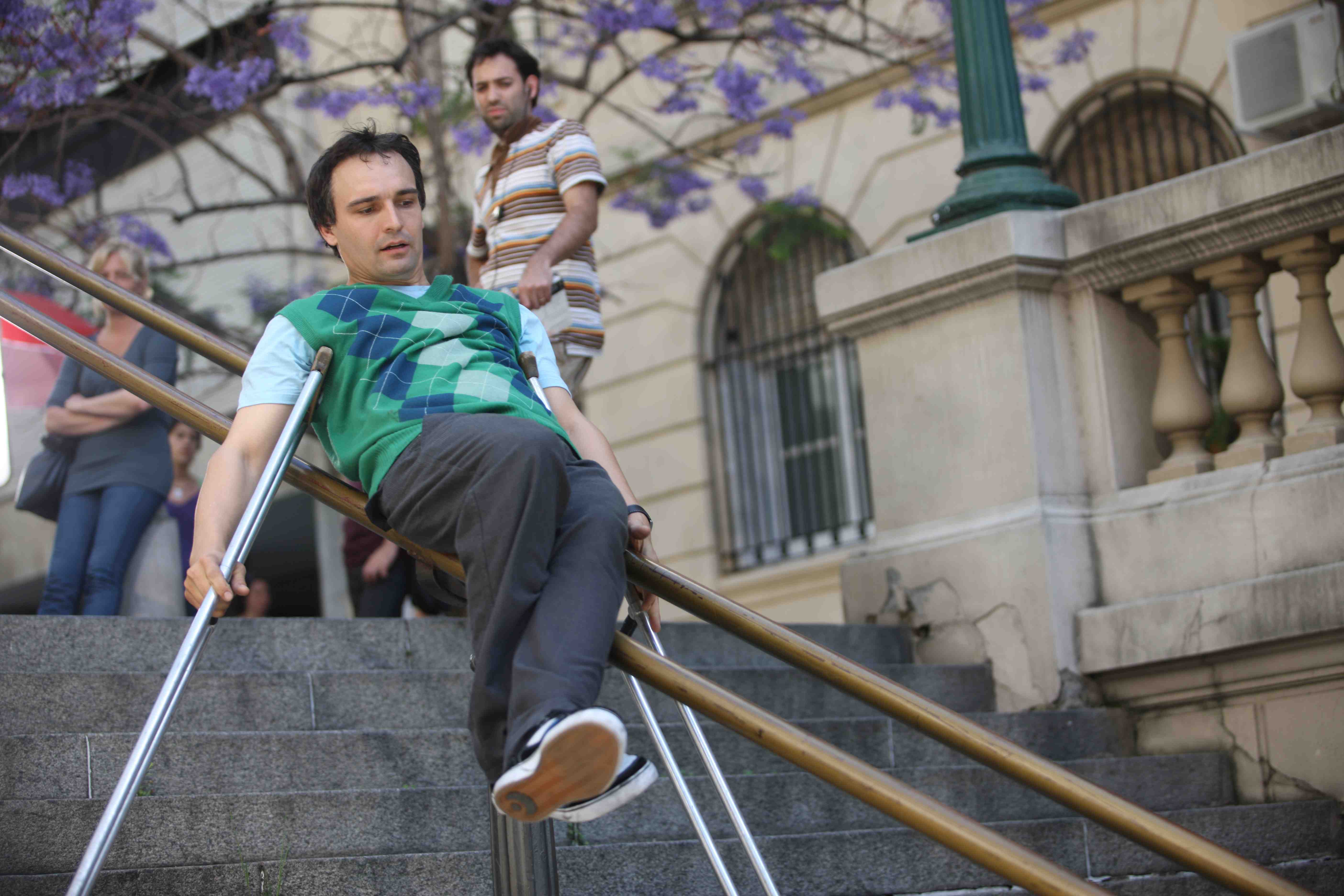
Bill Shannon makes the most of the street furniture of Buenos Aires
That'll be the latest outing for the 'Life Flows Better' campaign for Visa. It features the performance of Bill Shannon and was directed by Joey Garfield both of whom we came across last year while putting together the Saatchi & Saatchi New Directors showcase.
Here is the 80 second ad.
The track is Come on Train by Don Thomas which we had remixed by the Go Team and is now available on i-tunes. You can listen to the entire remixed track here.
This is the Promo for RJd2 that we featured on the new director's showcase.
For more information on the artist here is Bill Shannon's site.
And this is the Lifeflowsbetter YouTube channelhere.
Comments
whacking a logo on something that already existed.
sorry but not impressed.
just an honest opinion.
Posted by: Rachel Moorden. at March 15, 2009 09:30 AM
Rachel. Do you mean like Honda Cog, Cadbury Eyebrows and the Awareness test Moonwalking Gorilla? Although this was not a rip off from the creators like they were. And if you know your history how about Hamlet Photo Booth? Or Holstein Pils? Or ...
Posted by: Paul at March 16, 2009 11:04 AM
It just goes to show you can't be too careful!
Posted by: hardman at March 16, 2009 01:54 PM
Yes, I do mean like that.
And by the way are you seriously comparing this to Cog? No, I mean, seriously.
Posted by: Rachel Moorden. at March 16, 2009 08:49 PM
So what if its just putting logo on something that already exists? "a true artist doesn't copy he steals" Picasso...
I think advertising is creating popular culture, and part of that is giving people what they want to see. Loads of my friends saw this and thought it was really original and more importantly a cool ad for visa. obviously not everyone will love it, but it does come across as something different and fresh. Also i think today viewers want a back story to a great advert, so they can go on youtube and find out more about the advert.
Originality is overrated- as long as people perceive it to be than i think that should do,
Posted by: Hartmann at March 19, 2009 01:26 PM
You might be right, but if the post had come across as 'here's something we found that we thought would do a half decent job for Visa' then that would be OK. No?
But it didn't.
Once again it comes across as 'Saatchi are brilliant' which is disappointing, if only because we hear this from KR all the time, and frankly he does a better job.
With T-mobile I could appreciate the re-orientation to make it work for the category, with this I can't. I know flow, but I don't understand the relevance.
Nicely executed, and you're left in wonder at the individual, but the pay-off for the brand (beyond a nice bit of entertainment) is what precisely?
Posted by: jemster at March 20, 2009 01:26 PM
Looks really nice but I have to side with the 'not that impressed' people.
It's a bit disappointing compared to the last Visa advert, which I thought was a really entertaining and coherent piece of work.
This doesn't tell me much about Visa and I'm left with this sense that the lead character is in some way injured or disabled. Why is he like this? Do I have to be like this to qualify for these life-easing perks that come with the card? I also can't work out if he bought that hat, or if he stole it, like he does with the skateboard in the promo.
Bill Shannon is very impressive though. I hope he does well on Britain's Got Talent.
Posted by: james at March 20, 2009 03:44 PM
Not going to comment on the work as I'd just be repeating.
But I wish people would stop using that quotation from Picasso to defend lack of originality. That's not what he meant - he was suggesting that good artists make things their own, as opposed to machinistically reproducing them.
With that in mind, I think he'd be a bit disappointed to find out he was being invoked to defend borrowed entertainment.
Posted by: nick at March 24, 2009 10:54 PM
Have to say I am left cold by this too. A lovely piece of film, certainly.
But it feels like shoehorning a slightly clunky endline (does anyone ever say that life FLOWS better...?) onto an arresting visual device, neither of which seem to embody a brand truth?
Or is that just me trying to rationalise something that just didn't connect with me?
Posted by: Chris at April 20, 2009 01:44 PM