Small book, big ad
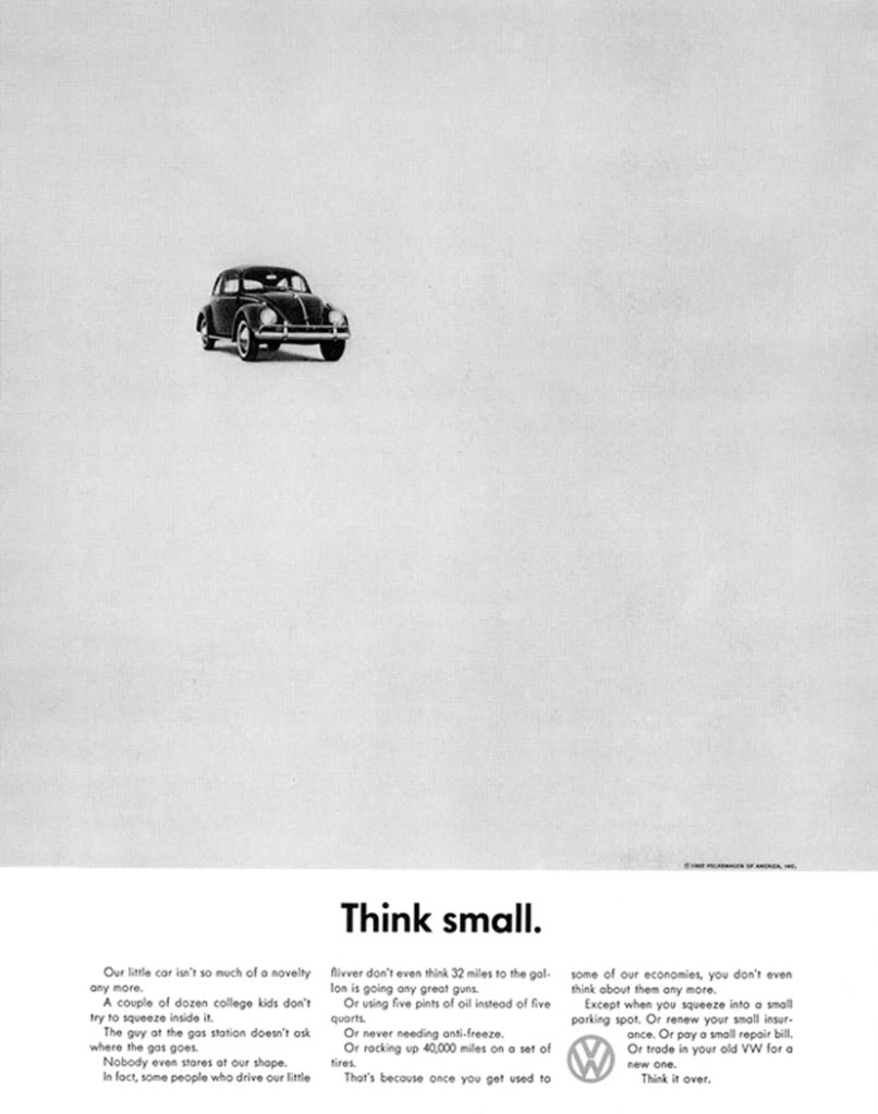
Think Small. This version by Helmut Krone and Bob Levenson.
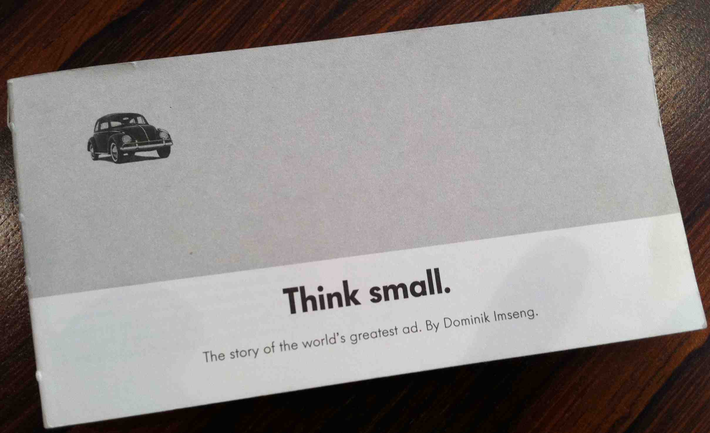
I have just received the most delightful book in the post from Switzerland. 'Think small, the story of the World’s greatest ad', written by Dominik Imseng, tells the full story of DDB’s iconic Think Small press advertisement for the VW Beetle. And the emphasis is on the word 'full' here since it traces the journey that brought this ad into existence back to the birth of both Bernbach and the Beetle. One in to a Jewish family in the Bronx and the other to the world’s most infamous anti-semite in Berlin. No matter how well you think you know this ad and the campaign it launched, im telling you, you only know half the story.
I’m a sucker for books about the advertising industry but one thing continues to surprise me. No matter the content, most publications about a profoundly creative business take little care over their presentation. Hegarty’s biography being a case in point, the man may have made a career out of zagging while others zig but this philosophy doesn’t extend to either the form of the book or the cover design. So it was rather lovely to find a book on advertising in which someone, and in this case it's the art director Bruce Roberts, has thought about the look, feel and form of the book as much as Imseng has about it’s content.

For starters it’s small and chunky, a bit like the Beetle, its format is landscape like a 48 sheet poster, and it’s set in Futura like the original VW ads. As Roberts also says, the threadsewn binding being on display, with no hard back or dust cover, “reflects the honesty of Think Small”. The result is a book that looks and feels as good as it reads.
And it is a good read. For anyone with an innate fascination for the genesis of the creative revolution in 1960s adland, this book offers a glimpse into the moment of conception of that revolution’s most famous ad. A glimpse that goes beyond the stuff of advertising folklore because it uses first hand accounts from some of the surviving characters in the story from Julian Koening and Bob Levenson (the two copywriters involved in the many iterations of the ad) to George Lois and Carl Hahn (the client at VW).
And why should you care? I mean it’s a press ad that’s half a century old for a product and campaign that have long ceased to exist.
Well I guess for me it’s about understanding where we have come from and why we think the things we think and do the things we do. It’s so easy to dismiss our past or to see it as irrelevant and old fashioned. I was at a D&AD talk recently and showed a bunch of students the Pregnant Man ad Saatchi’s created for the Health Education Council in the early ‘70s. Though this is one of the first uses of an conceptual idea to communicate a powerful public service message and is regarded as one of the finest pieces of creative thinking of that or any other era, they couldn’t have been less interested. And I’m sure their eyes would have similarly glazed over if I had talked about the meticulous, not to say obsessive, efforts Helmut Krone went to to perfect the art direction on Think Small. And I think that’s a shame. The solutions on display in this work may seem tired and outdated (although some of the best DDB VW work still appears startlingly fresh to me) but the ambition to rewrite the rules, challenge orthodoxy and create better, more intelligent work certainly isn’t. We call it the creative revolution because a revolution is exactly what it was and whether we acknowledge it or not it shaped the world view of most people in this business. For that reason alone it is worth understanding how this work came about and what it took to make it happen, so that we may do the same thing in our own era.
Comments
Much appreciated for the information and share!
Nancy
Posted by: Nancy at September 28, 2011 02:53 AM
Thanks for sharing this //
understanding where we have come from + meticulous, not to say obsessive, = startlingly fresh //
couldn’t have been less interested.= shock jock
Posted by: KK at September 28, 2011 08:45 AM
Interesting post but please do note the difference between its (possessive) and it's (it is) and correct all the errors! They are an obstacle to reading.
Posted by: Maddie at September 29, 2011 10:19 AM